
The admin
What you'll learn
How to shape the admin for your editors: the menu's groups, badges and pins, the command palette (⌘K) and shortcuts, and edit pages with tabs, sections that fold, rows and fields that show only when they apply.
Before this page: Configuration and Fields.
Everything here is set in the config: the admin needs no setup of its own. Each person can still fold groups, pin items and collapse the menu; those choices stay in their browser.
The menu
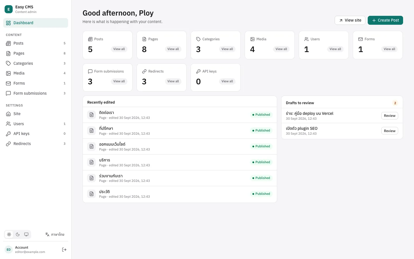
The menu has groups that fold, two levels deep:
Dashboard
Content          posts, pages… (collections without a group)
Media library
Shop             a group of a plugin, e.g. the shop's
  Catalog          products, variants…
  Sales            orders, payments…
Settings
  Site             globals, redirects
  Users & access   users, roles, API keys, single sign-on
  System           backups, email, deliveries, audit log
Collections, globals and pages name their group in admin.group; groups of your own are declared in admin.nav:
export default defineConfig({
  admin: {
    nav: [
      {
        id: 'library',
        label: { en: 'Library', th: 'ห้องสมุด' },
        icon: 'book-open',
        children: [{ id: 'authors', label: { en: 'Authors', th: 'ผู้เขียน' } }],
      },
    ],
  },
  collections: [
    { slug: 'books', admin: { group: 'library' }, fields: [/* … */] },
    { slug: 'people', admin: { group: 'library.authors' }, fields: [/* … */] },
  ],
  globals: [{ slug: 'footer', admin: { group: 'content' }, fields: [/* … */] }],
})- Without
group, a collection is under Content and a global under Settings › Site.group: 'settings'also means Settings › Site. - A label instead of an id (
group: 'Library') makes a group of that name, as before. group: falseleaves a collection, global or page out of the menu; links still reach it.orderplaces a group: Content is 0, the media library 10, plugins' groups about 100–200, Settings 1000. Within a group,admin.orderon a collection, global or page places it (lower first); those without one come after, in config order.- Declaring a group a plugin or Easy CMS has (
{ id: 'shop', label: 'Store' }, orcontent) changes its label, icon or order. - People only see what they may open, and groups with nothing in them are left out.
Numbers and badges
Each collection shows how many documents it has; admin.count: false hides it. A badge shows what needs attention instead, counted for each user from what they may read:
{
  slug: 'orders',
  admin: {
    badge: { where: { status: { equals: 'paid' } }, label: { en: 'to send', th: 'รอจัดส่ง' } },
  },
}
A folded group shows the sum of its badges. tone is accent (default), warning or danger.
What each person changes
- Folding: groups stay as they were left; the group of the open page always unfolds.
- Pins: the pin button beside a collection's title puts it at the top of the menu.
- Collapse: on wide screens the menu becomes icons (the button at its foot, or
[); a group's icon opens its items beside it. - Create: hover an item (or tab to it) for a + that creates a document there.
Arrow keys move through the menu; left and right fold and unfold groups.
Search and commands (⌘K)
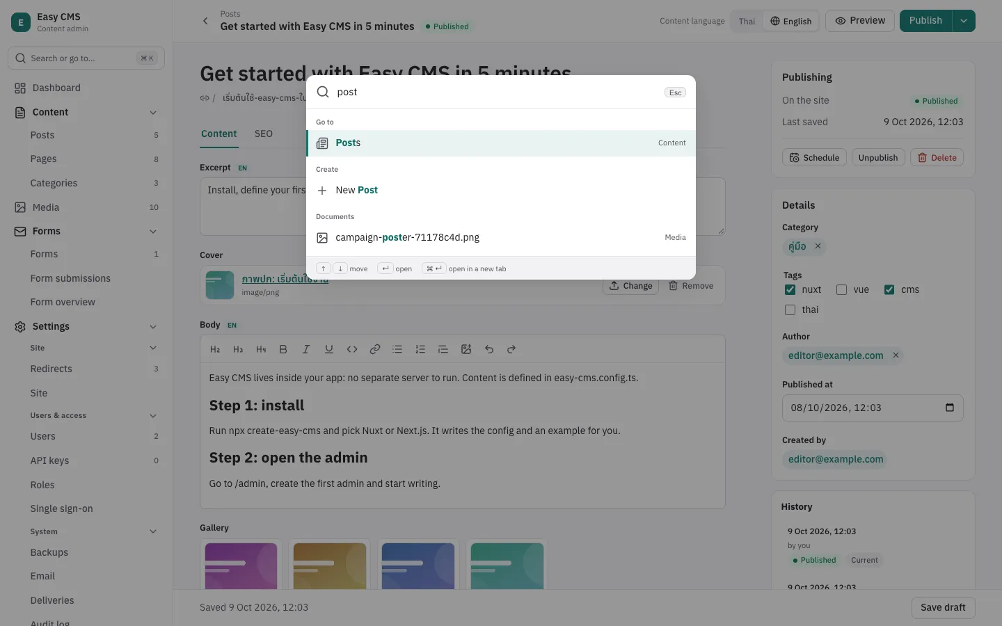
⌘K (Ctrl+K), / or the search box at the top of the menu opens the command palette:
- Go to any collection, global, page or setting, by name or group.
- Create a document of any collection you may create in.
- Documents: titles in every collection you may read and ids.
- Recently opened documents, before you type.
- Commands: theme, language, collapsing the menu, shortcuts, logging out, and your own:
admin: {
  commands: [{ label: 'Drafts to review', href: '/collections/posts?status=draft', icon: 'file-text' }],
}| Shortcut | |
|---|---|
⌘K, / | Search and commands |
⌘S | Save (without publishing a draft, or taking a page off the site) |
⌘⇧P | Publish |
[ | Collapse or expand the menu |
g then d | The dashboard |
? | All shortcuts |
Edit pages
admin.layout arranges the edit page by field name: tabs, sections that fold, and rows. It only changes how the page looks; the data stays as the fields say.
{
  slug: 'products',
  admin: {
    layout: [
      { tab: 'Product', fields: ['title', 'slug', { row: ['brand', 'category'] }, 'description'] },
      {
        tab: 'Shipping',
        fields: [
          { row: ['weight', 'width', 'height'] },
          { collapsible: 'Customs', collapsed: true, fields: ['hsCode', 'origin'] },
        ],
      },
    ],
  },
  fields: [
    { name: 'title', type: 'text' },
    { name: 'brand', type: 'text', admin: { width: '1/3' } },
    { name: 'category', type: 'relationship', to: 'categories', admin: { width: '2/3' } },
    { name: 'hsCode', type: 'text', admin: { description: 'The customs tariff code' } },
    // …
  ],
}- Top-level fields, each placed once. Fields not placed follow at the end, in the first tab; fields with
admin: { position: 'sidebar' }stay in the side column. - With tabs, every entry at the top is a tab. A tab shows how many of its fields have errors.
rowputs fields side by side, an equal share each or theiradmin.width('1/4'…'full'); on narrow screens they stack.collapsiblesections fold;collapsed: truestarts folded.admin.descriptionon a field adds help below it.- The SEO plugin puts its fields in an SEO tab of their own (
tab: falseto keep them below the other fields).
Conditions
admin.condition shows a field only when the fields beside it match:
fields: [
  { name: 'linkType', type: 'select', options: ['internal', 'external'] },
  { name: 'page', type: 'relationship', to: 'pages', admin: { condition: { field: 'linkType', equals: 'internal' } } },
  {
    name: 'url',
    type: 'text',
    required: true,
    admin: { condition: { field: 'linkType', equals: 'external' } },
  },
]equals, not_equals, in: [...], not_in: [...] and exists: true | false (named as in where), combined with and, or and not. field names a sibling (in a group or an array row, the fields beside it), or a path inside one (link.type). The server reads the same condition: a hidden field isn't required, and keeps its value.
Saving
- A save that fails lists every field to fix at the top of the form, opens the tab or section of the first, and moves focus there.
- Unsaved changes are kept in the browser while you type; opening the document again offers them back.
⌘Ssaves,⌘⇧Ppublishes.
The side column
Plugins' panels (admin.sidebar) come below the side fields; position: 'top' puts one right below publishing, e.g. an order's actions:
admin: { sidebar: [{ tag: 'ecms-order-actions', position: 'top' }] }Lists
- Going back from a document returns to the list as it was: search, filters, page and scroll.
admin.emptysays what a collection is for before it has documents:
admin: {
  empty: {
    description: 'Add the first product: a name, a price, then publish it.',
    link: { label: 'Shop guide', href: 'https://example.com/docs/shop' },
  },
}